Cromatica continues the story of Brera: the same exploration of raw earth, its grain and variations, interpreted in porcelain stoneware through colour.
We chose colour because it contributes to the character of a place: it gives a wall presence, enters into a relationship with light and other materials, and opens up expressive possibilities for those who design a space and those who inhabit it.
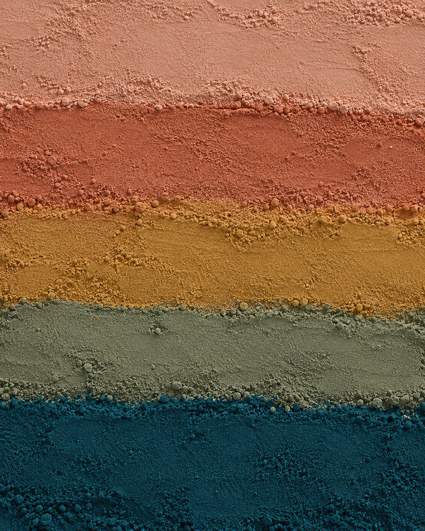
Our research began with Brera’s material character. We sought shades that would preserve its recognisable texture while giving it a different expression. The result is Cotto, Cipria, Ambra, Salvia and Petrolio: five colour interpretations of the same material origin.
The two collections are designed to work together. Possible pairings include Cotto with Avorio, Cipria with Terra, Ambra with Sabbia, Salvia with Taupe and Petrolio with Grigio. These relationships offer a starting point for coordinating floors and walls, neutral areas and coloured surfaces, leaving each project free to find its own balance.
Decoration extends this freedom. Infinito on Cotto, Segno on Cipria, Ricamo on Ambra, Velo on Salvia and Tetra on Petrolio bring different patterns and rhythms to the material. Lumen on Cipria and Volta on Salvia explore a further expression through third firing. Colour thus meets pattern, giving each wall an identity of its own.
Cromatica continues Brera’s story and expands its language: earth, colour and decoration, conceived to belong within the same project.