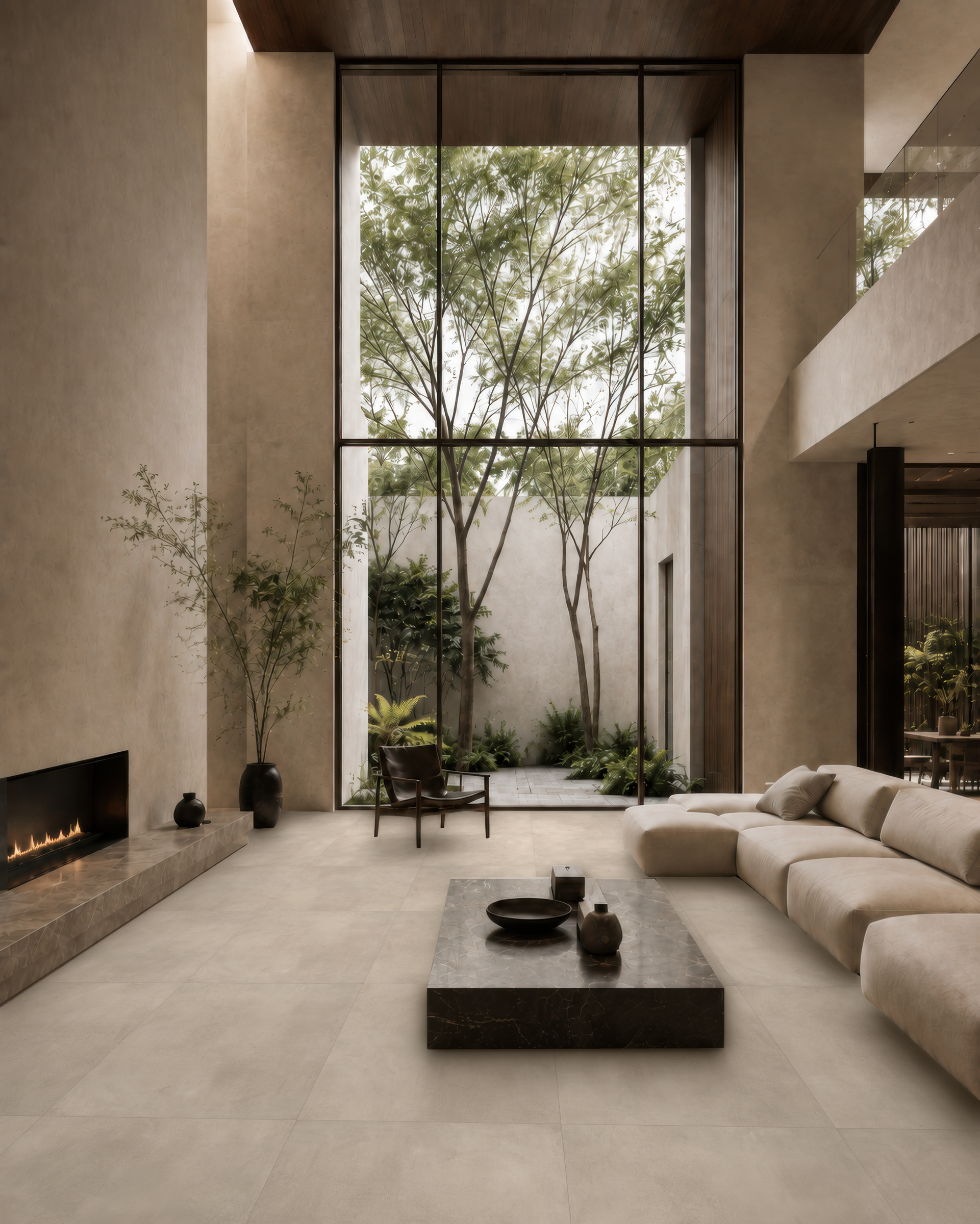
An imagined setting from the Brera campaign.
Up close, a surface offers details our eyes can follow. A few steps away, those same marks become part of a broader perception, alongside the window, the floor and the objects. Both readings matter in our everyday relationship with materials.
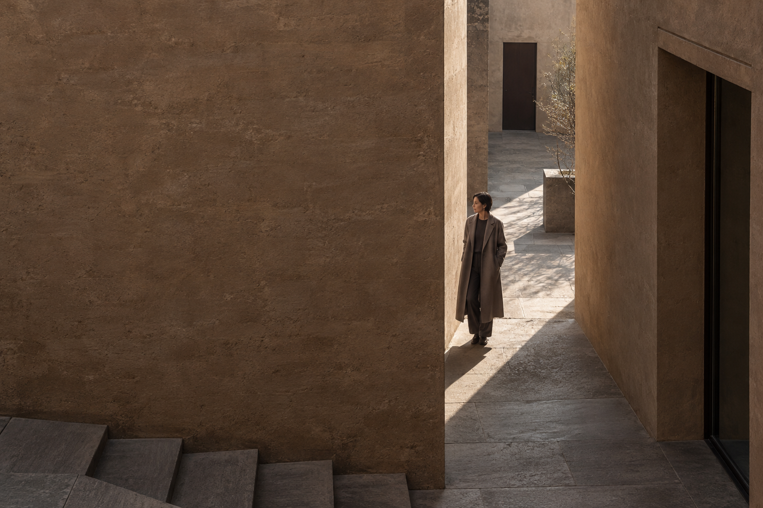
Brera interprets raw earth through a ceramic surface: trowel marks, subtle tonal layers and a textured matt finish define its character. Avorio, Sabbia, Taupe, Terra and Grigio are the series’ five colours. The reference to earth is expressed through the surface’s design and tone.
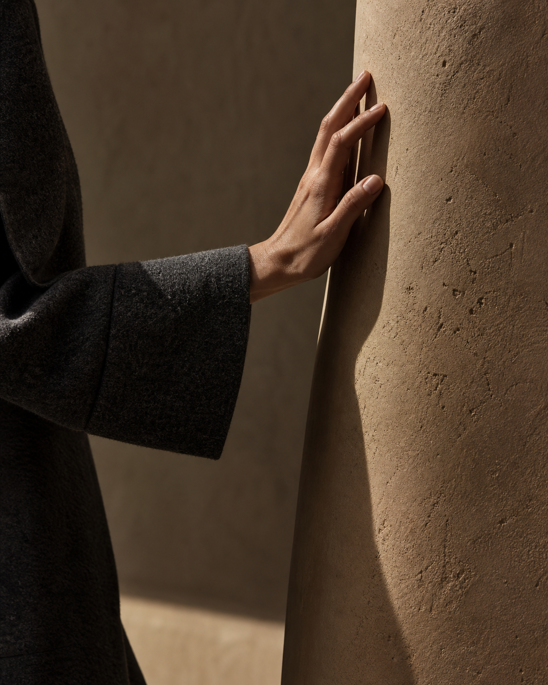
The trowel marks suggest a movement the eye can follow; the tonal layers introduce variations within the field of colour. Assessing their presence in a design calls for a change of distance. The detail observed on a sample and the surface seen from a doorway answer two different questions: what do we encounter up close, and what holds the room together?
A wall beside a table stays in our field of vision for a long time. A surface along a passageway is encountered in motion, for a few moments at a time. Even when the material is the same, the design determines when and how we encounter it. We can therefore consider how much prominence to give the texture in relation to the objects and other surfaces it will accompany.
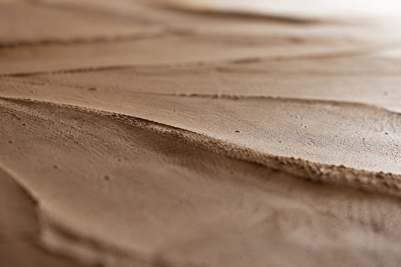
The position of openings adds another condition to observe. The direction of light can make some marks easier to read and others less evident. Looking at the sample in the room at different times helps us recognise these variations and compare them with the image we had in mind. The choice of tone thus acquires a precise context.
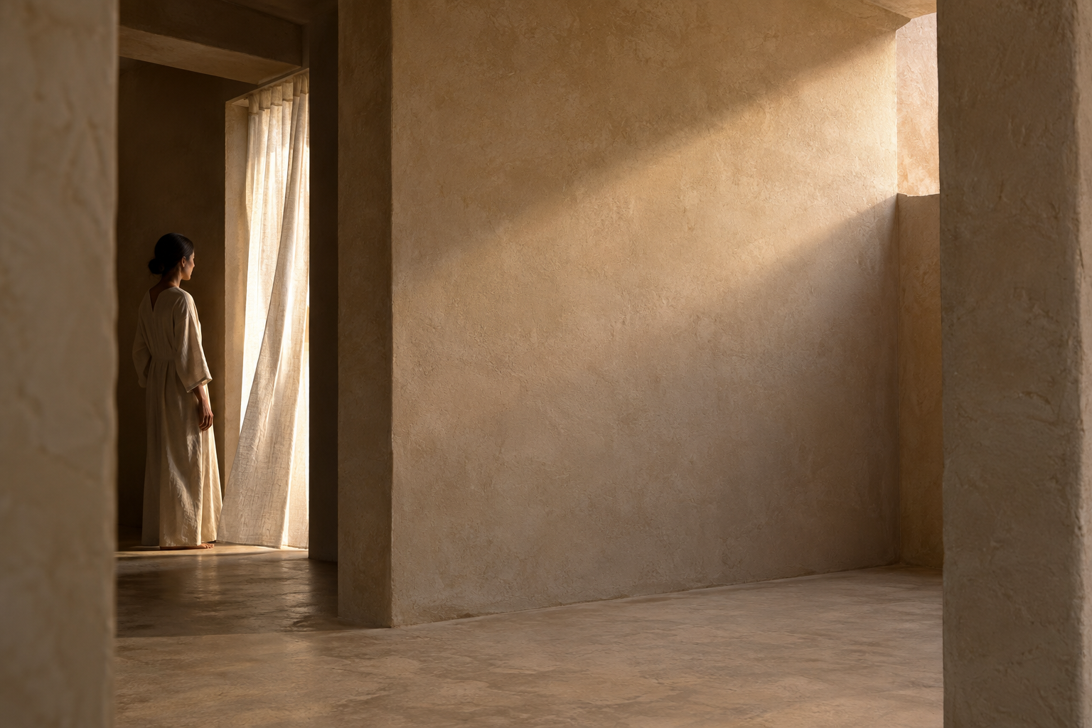
For Noema, the passage from earth to room happens here: in the way a material reference enters the life of a space. Brera brings a texture; the design determines its viewing distance, its light and its proximity to everyday things.