
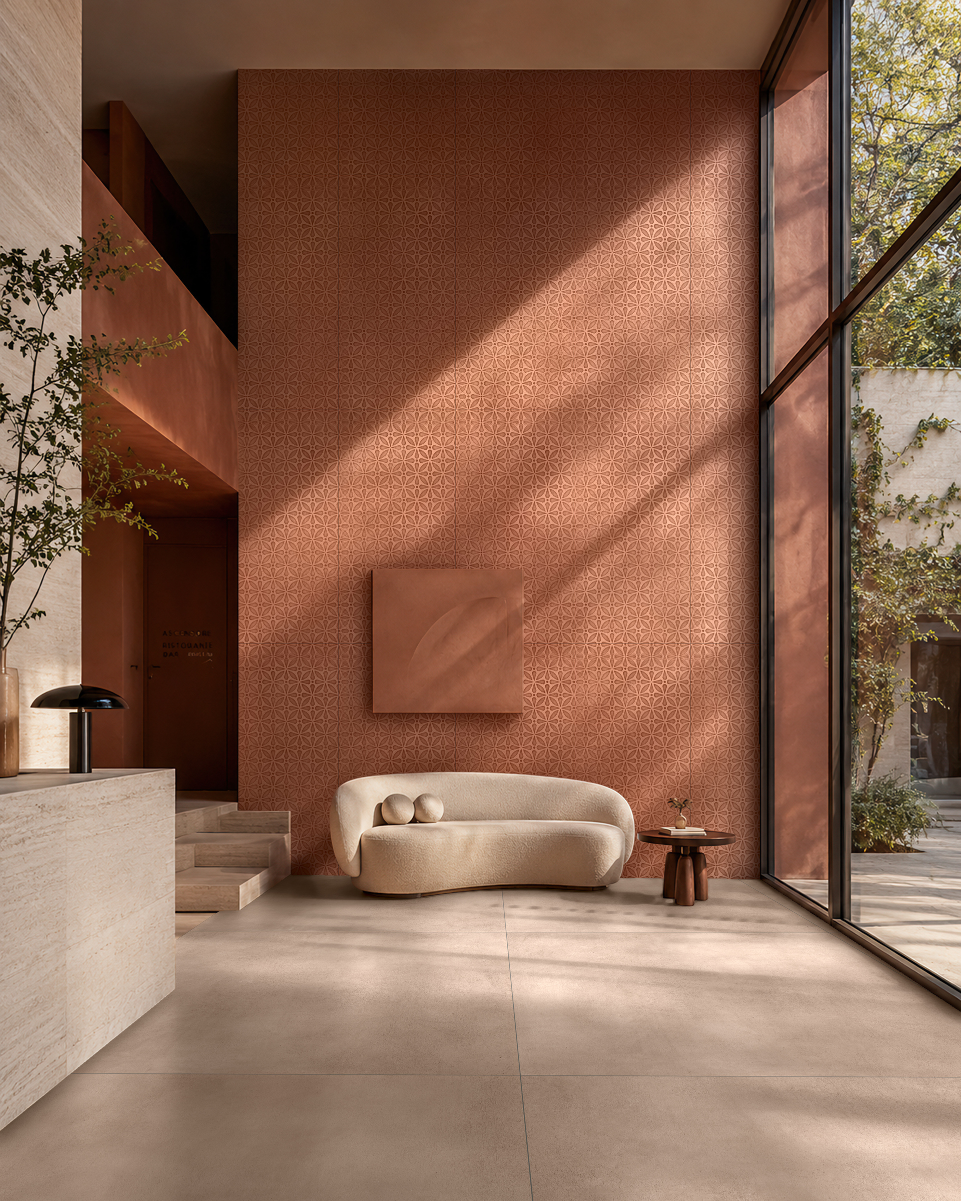
An imagined setting from the Cromatica campaign.
The colour of a sample occupies a space we can hold in our hands. The colour of a wall accompanies the body, is visible through a doorway and meets the floor. Between these two scales lies a design decision: how much space should we give the shade that caught our attention?

Cromatica offers five starting points: Cotto, Cipria, Ambra, Salvia and Petrolio. Each colour can be given a different task. It can bring continuity to a wall, define a part of the room or establish a link with another material. Its extent is as much a part of the choice as its shade.

Imagine a niche beside a passageway. Cladding its back concentrates the colour at a precise point in the room; continuing it along the sides brings it into view as we approach. If the same choice extends across the whole wall, the set of relationships to consider changes: the door, the ceiling edge and the furniture that will stand in front of it.
It is worth looking, then, at where the colour ends. An edge close to a window or door frame can have a strong presence, even when the area covered is small. A large wall seen through a narrow opening can appear as a contained field. Measuring square metres helps; observing where we will see the wall from helps us assess its presence.

Light and nearby materials make this assessment more concrete. A sample placed beside the intended wood and viewed in the conditions of the room allows a more useful comparison than an isolated shade on a screen. We can ask what relationship we want between that wood and the colour, and how much of each will be visible at the same time.

For Noema, giving Cromatica a role means reaching these decisions. The name of the shade opens the choice. The design determines its extent, its boundaries and its combination with other materials. This is how colour becomes part of the room.